Jump to Navigation

Me on Twitter

  • RT @computerfact: concerned parent: if all your friends jumped off a bridge would you follow them? machine learning algorithm: yes. 6 years 36 weeks ago
  • RT @timberners_lee: We have lost a colossal mind and a wonderful spirit. Rest in peace, Stephen Hawking. https://t.co/ectv7r4UIm 6 years 37 weeks ago
  • RT @helenvholmes: Yes, let's https://t.co/tM4iF50idY 6 years 41 weeks ago
  • Do people who can afford a LG wallpaper TV really care about paying it 7,999.99$ rather than 8,000$ ??? 7 years 1 week ago
  • As I understand this is 1 step closer to breaking current cryptography standards. Goodbye #privacy https://t.co/ncka6ldRV8 #quantumcomputing 7 years 2 weeks ago
  • Write 'cookie' in Unicode : 7 years 5 weeks ago
  • RT @FBonnifet: Un peu de pédagogie pour tous ceux qui n'ont pas compris l'intérêt d'une taxe carbone 7 years 7 weeks ago
  • @laquadrature Google sometimes frightens me. It just looked into my photos to suggest me a better look for my last… https://t.co/kGT8dnmVDb 7 years 8 weeks ago
  • "Voici les quatre mesures qui menacent notre vie privée" https://t.co/I6spzN5QKB 7 years 8 weeks ago
  • RT @datagouvfr: Service public de la donnée: les données du Cadastre sont maintenant disponibles en #opendata: https://t.co/BNfYwaFRhp http… 7 years 8 weeks ago

Small devices are ignored

This has been annoying me since the beginning : small screen devices are not taken into account by the vast majority of apps editors.

Worse : despite Google's pleading about size-caring (see http://developer.android.com/design), they recommend patterns that actually don't fit the real small screens for which size-caring IS important.
Example : the "action bar" and other icon bars : there is no place for such bars on small screens...

Of course the developer is able to adapt the GUI depending on the size of the screen, but if Google does not make it clear then I fear the battle is already lost...


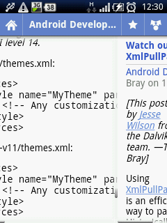
Here are screenshots of Android Market and Google Reader on an Xperia Mini (HVGA 320x480, 88mm long) :

Android Market on Xperia MiniGoogle Reader on Xperia Mini

On the left screenshot : buttons zones are not clearly defined and the zoom button is too small, making it difficult to finger-tap them on small screen. Furthermore, one can only see 2 applications from the list (there was a screenful of it in the previous version)...

On the right screenshot : the user is swiping by mistake to the next article because the content is too large for the screen... Ooops too late ! If you swipe back to the previous article you'll have to scroll down again to where you were (this happens to me all the time...).


Another damage of device fragmentation...


Related links

Comments

Post new comment

The content of this field is kept private and will not be shown publicly.
  • Web page addresses and e-mail addresses turn into links automatically.
  • E-Mail addresses are hidden with reCAPTCHA Mailhide.
  • Allowed HTML tags: <a> <em> <strong> <cite> <code> <ul> <ol> <li> <dl> <dt> <dd>
  • You can enable syntax highlighting of source code with the following tags: <code>, <blockcode>, <drupal5>, <drupal6>, <java>, <javascript>, <php>, <python>. The supported tag styles are: <foo>, [foo].
  • Twitter-style #hashtags are linked to search.twitter.com.

More information about formatting options

By submitting this form, you accept the Mollom privacy policy.